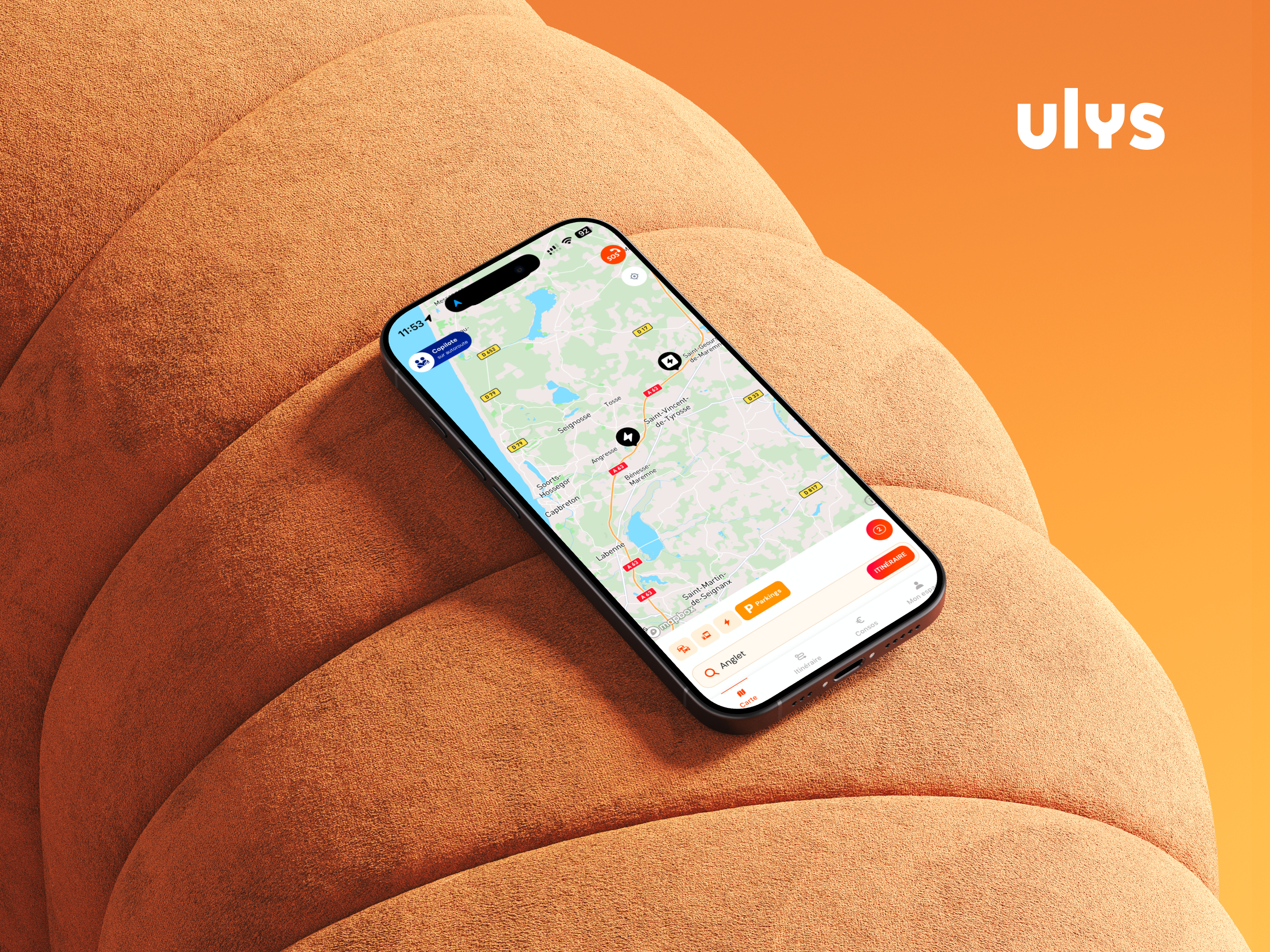
In mobility, decisions are made fast. Icons are often the first, and sometimes only, point of understanding.
Context
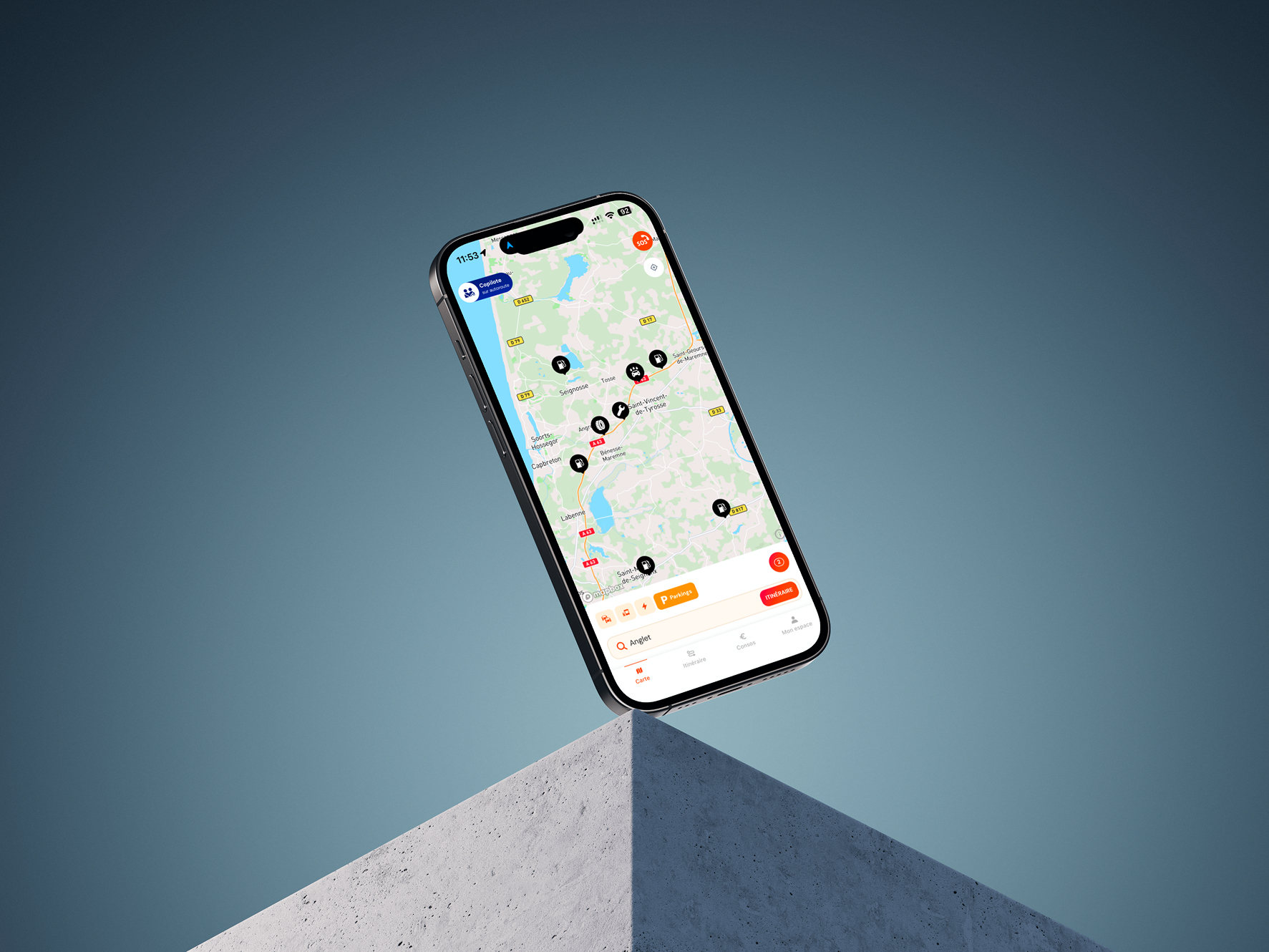
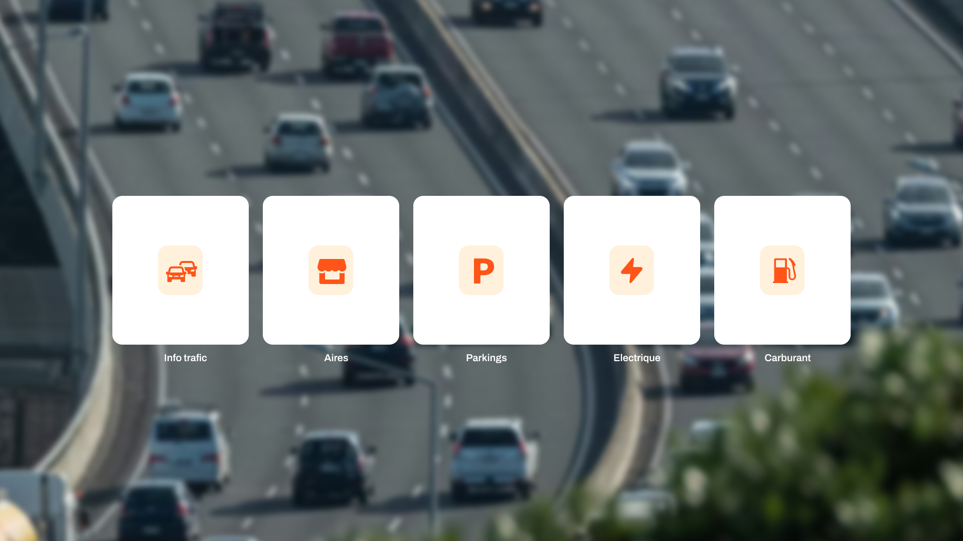
Ulys brings together multiple mobility services (tolls, parking, electric charging) used daily across mobile and web environments. As the product ecosystem grew, clarity became a challenge: icons needed to work everywhere, instantly, and without ambiguity.
✨ The key question ✨
How can icons become a true UX backbone: clear, scalable and cross-device?
My role & angle
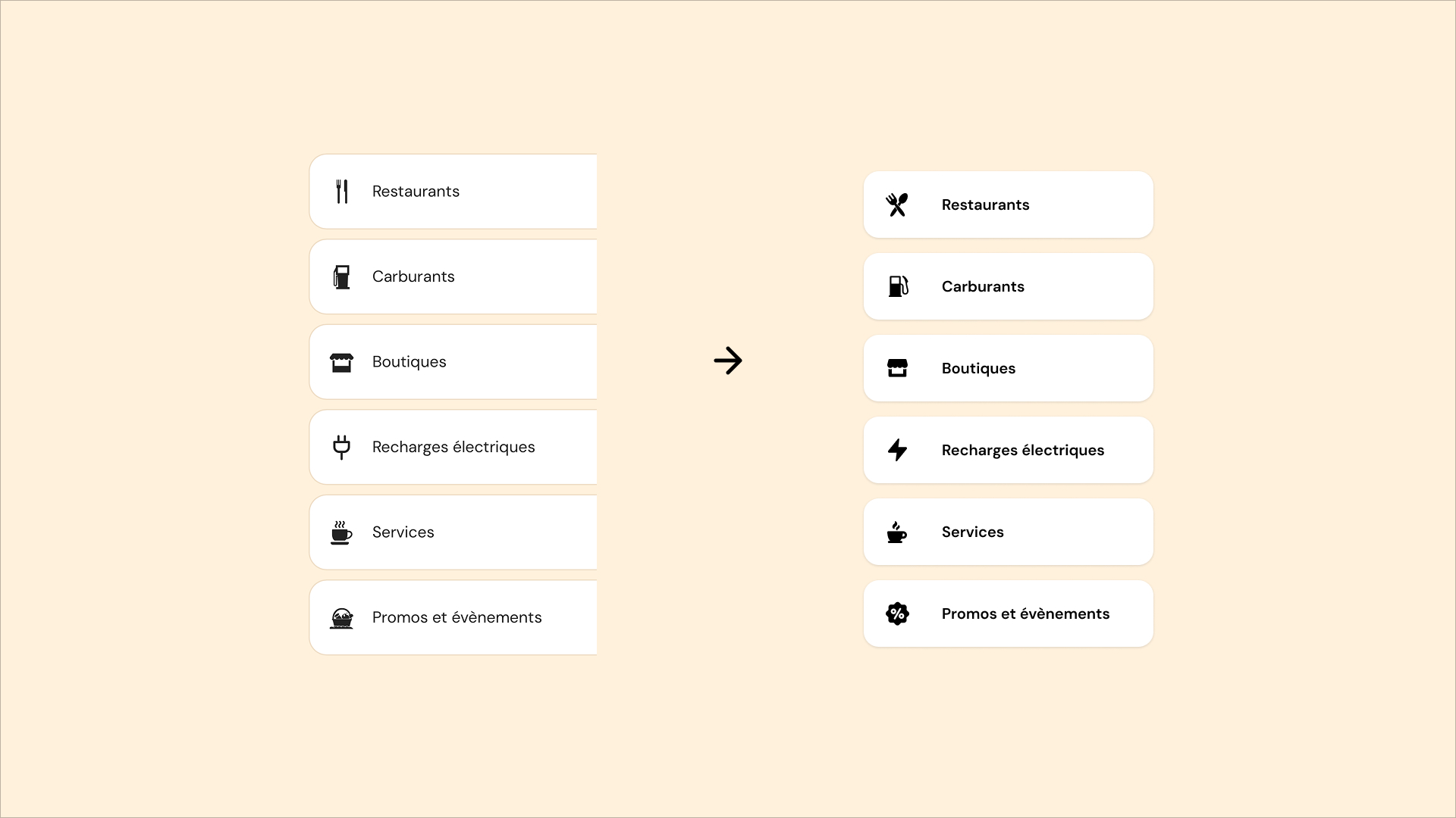
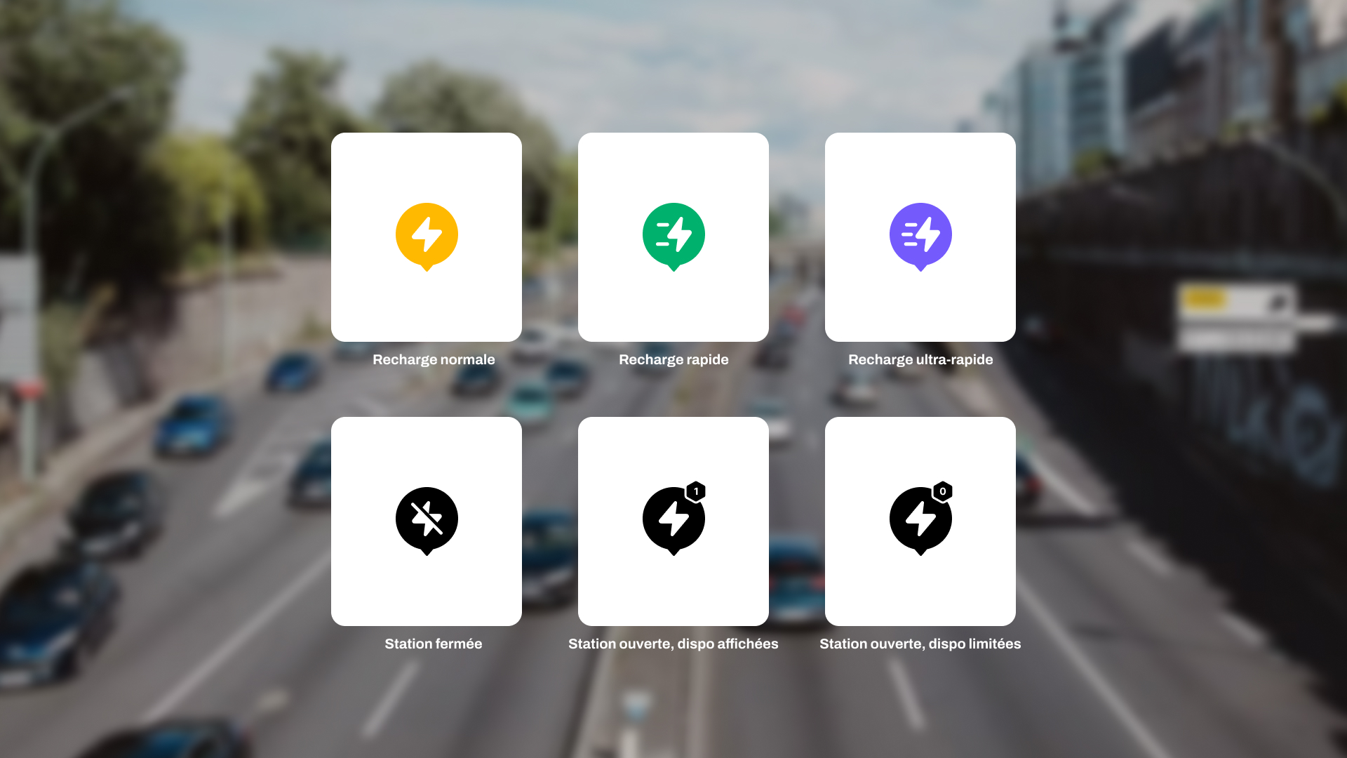
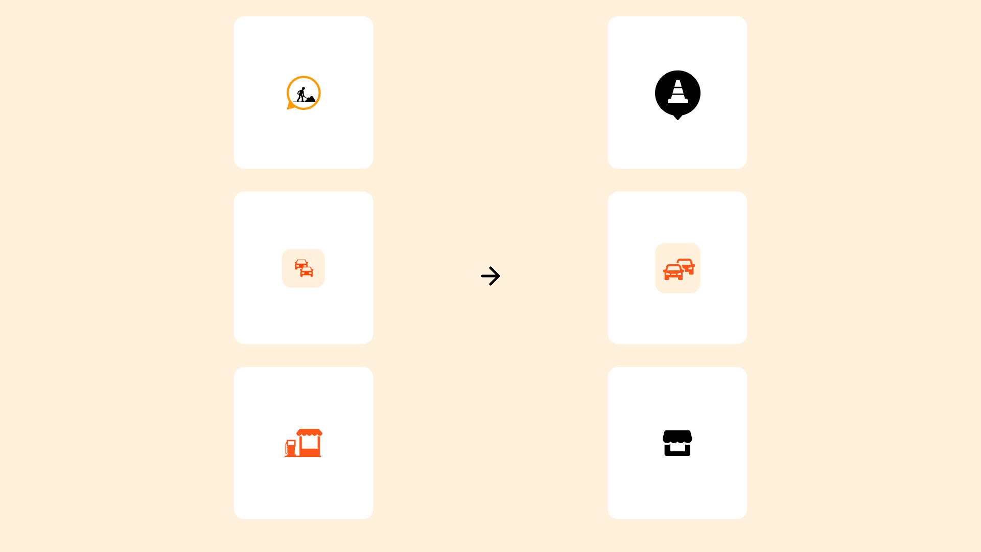
My work focused primarily on redefining the iconography system. Not as decoration, but as a core UX layer. Icons were designed to structure understanding across devices, contexts and moments of use. From there, the mobile app UX was refined — always driven by icon clarity and consistency.
Key challenges
→ Clarify complex mobility services through a shared visual language
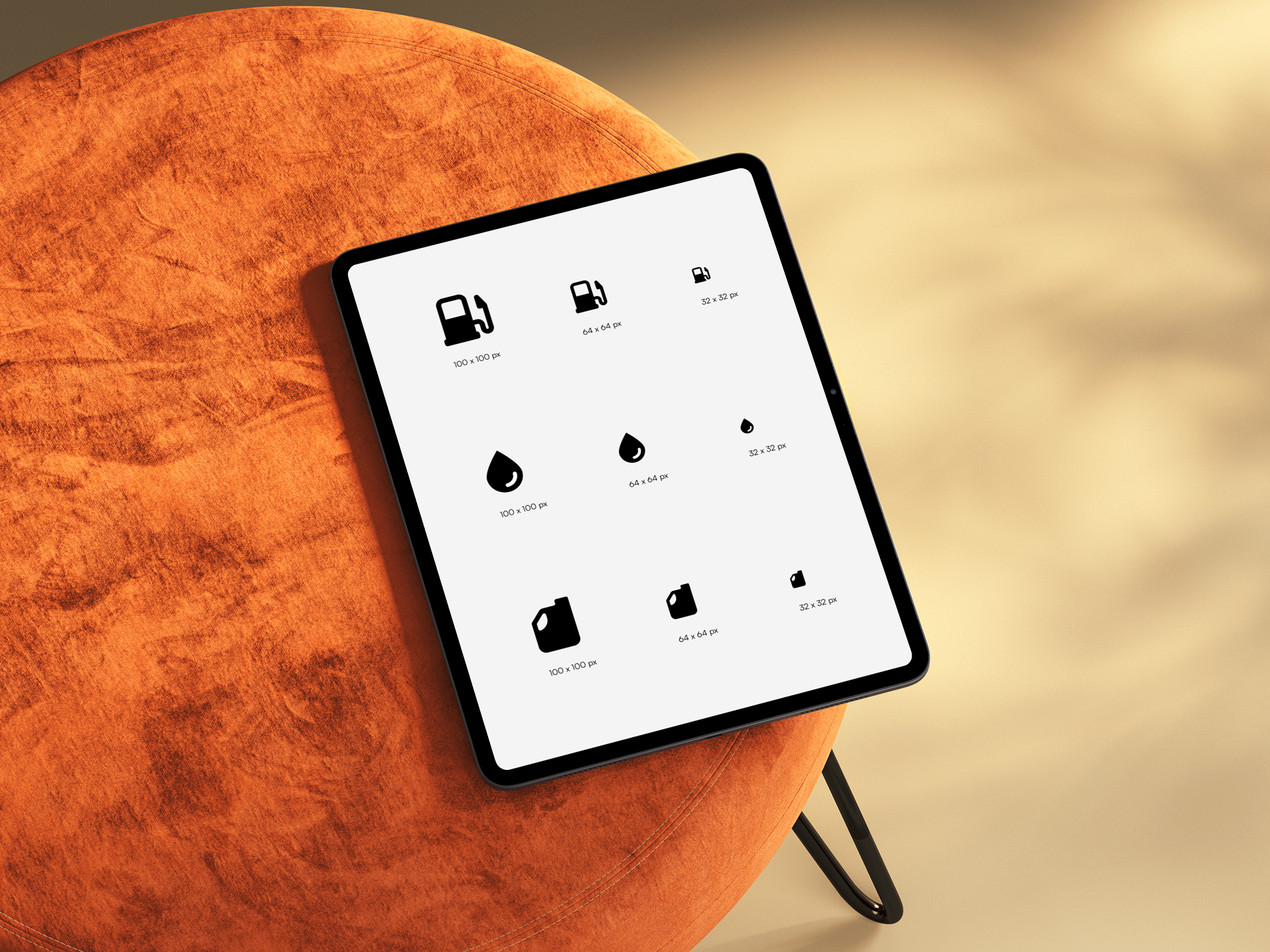
→ Design icons readable across mobile, web and embedded contexts
→ Reduce cognitive load in fast, real-time usage situations
→ Ensure long-term scalability of the icon system
→ Use iconography as a foundation for UX improvements
Design approach
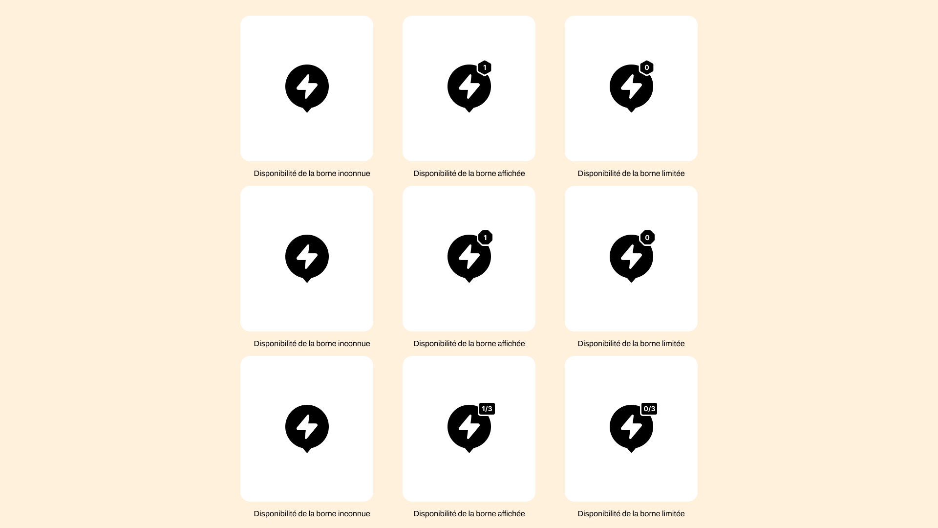
❍ Redesign the icon set with a focus on clarity, consistency and legibility
❍ Define a cross-device icon system adaptable to multiple contexts
❍ Use icons to structure navigation and guide user decisions
💥 Impact
The redesigned icon system improves readability and understanding across the Ulys ecosystem, supporting faster decisions and a more fluid experience. By anchoring the UX in a strong visual language, the product gains clarity, consistency and scalability.


Marie s'est vite appropriée un brief complexe sur la création de l'iconographie d'un nouveau service et l'optimisation de l'iconographie existante. J'ai beaucoup apprécié son esprit de synthèse, son argumentation, ses créations et sa prise d'initiative.
Claire Mitjaville
Brand Marketing Manager, ULYS